What a Photo-Based Color Analysis Actually Checks
Photo-based color analysis checks the relationships between the colors you are wearing, not whether a single color suits your skin.
The analysis reads the outfit as a system. Three things do most of the work:
- How many colors are in play. One dominant color with a supporting tone reads calmer than four colors competing for attention.
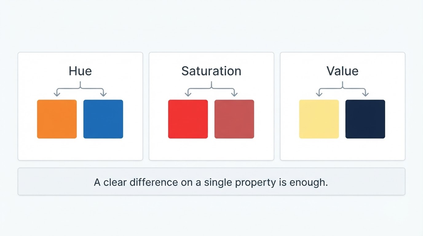
- The contrast structure. Light against dark, warm against cool, matte against shine — contrast is what makes an outfit look intentional instead of accidental.
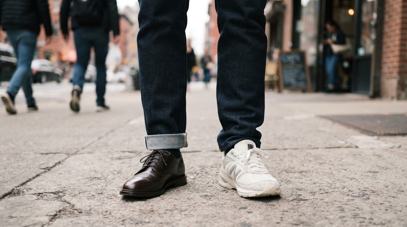
- Accents and noise. Shoes, bag, belt, watch, scarf, and outer layer are small in area but loud in effect. Every extra accent color adds one more thing the eye has to process.
This is different from a color season test. A season analysis uses your skin, hair, and eyes to build a personal palette. An outfit analysis uses only the photo in front of it, which is why it can say "these two colors fight" without claiming anything about your undertone.
What It Can and Cannot Tell You
A photo-based analysis can grade the color logic of today's outfit; it cannot identify your seasonal type or certify a color as right for you in every setting.
What it does well:
- Spots a clash between two garments that are fine on their own.
- Flags when one piece dominates, or when an accent competes with the main color.
- Returns a keep/change list you can act on in a minute.
What it cannot do:
- Work around bad lighting. Colored bulbs, a yellow desk lamp, or deep shade shift every color in the frame.
- Judge fabric behavior. Sheen, weave, and drape change how a color reads in person, but they flatten in a photo.
- Replace a mirror. If the photo is blurry, cropped, or filtered, the analysis is reasoning about a picture rather than about your outfit.
How to Take the Photo
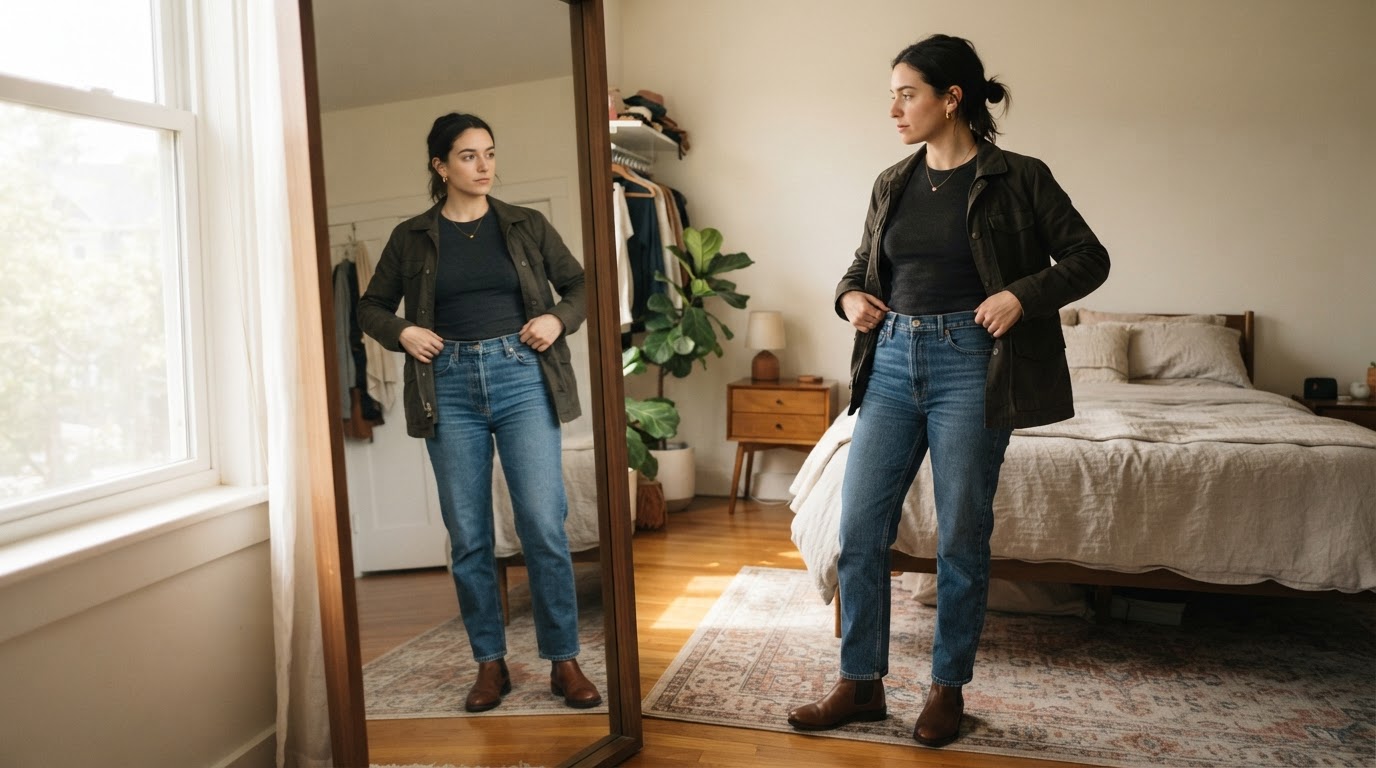
Shoot in even, neutral light with your whole outfit in frame; your camera decisions matter more than the tool you use.
A repeatable setup:
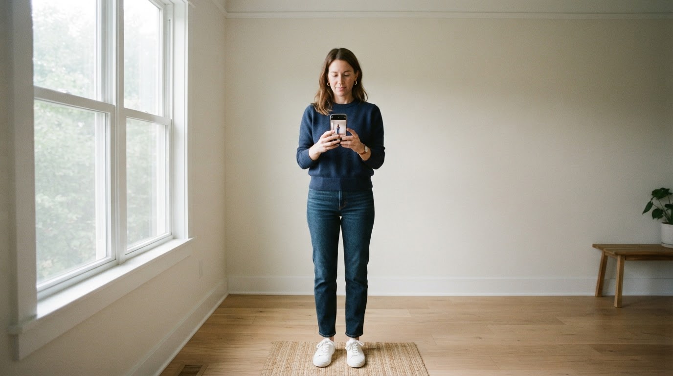
- Stand somewhere with soft daylight — facing a window works better than standing under a ceiling light.
- Frame yourself head to shoes. Cropping out your shoes removes one of the loudest color decisions in most outfits.
- Keep the background plain. A busy wall, a patterned rug, or a bright poster competes with your colors.
- Hold the phone around chest height and step back until you fit comfortably.
- Turn off filters, beauty modes, and auto-enhance. Each one recolors fabric.
- Shoot the same way every time. A fixed spot and a fixed distance make yesterday's result comparable with today's.
Most photo tools accept a standard JPEG or PNG from your camera roll, and some let you paste a copied image instead of uploading it. Check the size and format limits before you shoot a burst you cannot use.
How to Read the Result
Read the result as a short list of decisions — what to keep, what to change first, and what is optional.
Most photo-based tools return some version of a score plus written feedback. The score is the least useful part. What matters is which conflicts were named:
- Keep list. These are the combinations the analysis is not asking you to touch. Leaving them alone is the point of a linter-style read.
- Top one or two fixes. When several issues are listed, change the largest area first. A jacket or trousers outweighs a bracelet.
- Color ratio. A practical default is one color owning most of the look, a second supporting it, and a third kept to small accents. When feedback shows a base/support/accent split, that is the structure it is describing.
- Contrast note. If the feedback mentions flatness, add contrast with light against dark or a change of texture. If it mentions harshness, bring the extremes closer together.
- Noise flags. Each extra accent — a patterned bag, a bright belt, a scarf — is one more chance for the eye to be pulled away from the main color story.
Key Answers at a Glance
What does a photo-based color analysis measure? How the colors in your outfit relate in one photo: how many there are, how they contrast, and whether small accents are pulling focus.
Does it need my skin tone? No. Outfit analysis reads garments against each other; personal color season analysis is a separate exercise that uses your skin, hair, and eyes.
Is one photo enough? Yes, if the light is neutral and your full outfit, including shoes, is visible.
How accurate is it? Only as accurate as the photo. Consistent, neutral lighting gives consistent feedback; mixed lighting gives noise.
How many colors should an outfit have? There is no fixed number, but one dominant color plus a supporting tone and a small accent is the most reliable structure to start from.
What if the analysis flags a color I love? Keep the piece and reduce its area. A bright color worn as a small accent reads very differently from the same color across a full jacket.
Do I have to buy anything? No. Most fixes are about removing a piece, changing which color dominates, or repeating a color you already own.
Why do I get different results on different days? Because the photo changed. Camera position, light color, and background all shift how fabric color is captured.
Follow-Up Questions, Grouped by Intent
Getting Started
Can I do this with a selfie? A selfie shows your face and top, while an outfit color analysis needs the whole look — use a full-body frame even if it feels less flattering.
Do I need a full-length mirror? Not necessarily. Any setup that captures head to shoes in even light works, including a phone propped on a shelf.
What time of day is best? Daytime near a window, without direct sun hitting the fabric, gives the most neutral color capture.
Reading the Verdict
Why does it flag colors that look fine to me? Because it is reading the photo, where saturation and contrast flatten. If a conflict appears only in the photo, re-shoot before you change the outfit.
Why is one piece called "loud"? Area and saturation decide loudness. A large, highly saturated garment carries more visual weight than a small one, even when both are the same color.
What does "noise" mean in color feedback? An accent color that does not connect to anything else you are wearing. Two or three are usually manageable; beyond that, the eye stops finding a center.
Acting on It
How do I fix a clash without buying clothes? Remove the least necessary piece, let one color dominate, and repeat one color somewhere else — belt, socks, or shoes — so the palette looks deliberate.
Should I always follow the suggestion? No. The analysis knows the photo, not the dress code, the weather, or your comfort. Override it when the occasion or your own preference matters more.
How often should I run it? Before an event, or on a morning you are unsure — not every day. Repeated runs are most useful when the photo setup stays the same.
Does it work for every style? It is strongest on outfits where color is doing visible work. Monochrome and heavily patterned looks are harder to read from a photo, for the same reason they are harder for the eye.
How to Run It in Under a Minute
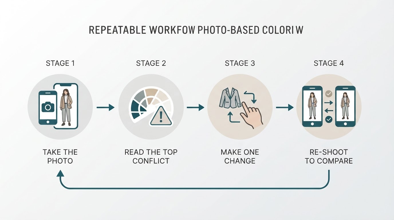
Start with the shot, then make one change — the loop is what produces better outfits, not the score.
- Take the full-body photo in your usual spot.
- Upload it, or paste it if the tool supports a copied image.
- Read only the top conflicts and the keep list.
- Change the single item with the largest area or the loudest accent.
- Re-shoot and compare the two photos side by side.
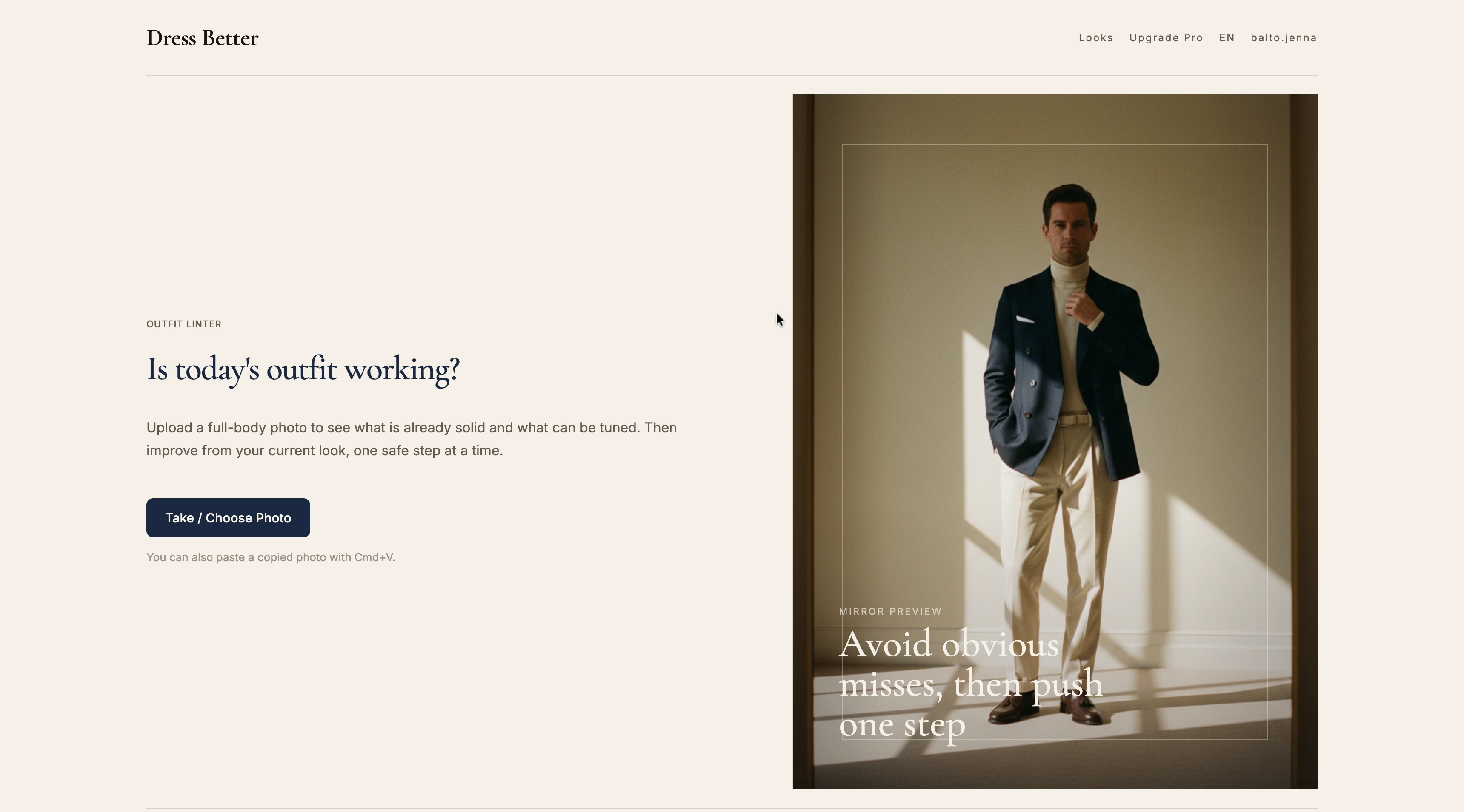
Dress Better is one example of a tool built around that loop. It analyzes a full-body outfit photo on color coordination, fit proportions, material choices, and occasion fit, and it does not ask for height, weight, or style preferences first — you can upload a photo or paste one straight into the analysis. That makes it usable as a quick check before you leave rather than a wardrobe project.
Felo product screenshot.
The Bottom Line
Photo-based color analysis is a fast second opinion on the colors you already own. It is most useful when you fix one thing and re-check, and least useful when you treat a single score as a final verdict.
If the photo is neutral and complete, the analysis will usually name one real conflict you can resolve in a minute. If the photo is not, change the photo before you change your outfit.