The short answer
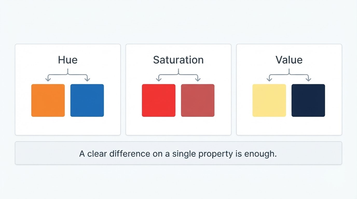
The colors in your outfit clash when they fight on one of three properties: hue (which color it is), saturation (how loud it is), and value (how light or dark it is). Two colors work when they differ clearly on one property and agree on the others. They start to look wrong when they sit too close to read as a deliberate contrast and too far apart to read as a match.
That means clashing is rarely about specific color names. It is about contrast: which property is carrying the difference, and whether that difference looks intentional.
Key answers
- Any two colors can work together. What breaks an outfit is a mismatch in hue, saturation, or value, not the pairing itself.
- Red and green don't clash by default. They clash when both sit at the same brightness and saturation with no neutral between them.
- Black with navy, or black with brown, rarely clashes. It looks off when the two darks sit at almost the same value, so the eye reads a near-miss instead of a contrast.
- Saturation is the most common culprit. One vivid piece next to muted pieces at the same lightness looks like a mistake rather than a choice.
- Three colors is a working limit, not a rule. The practical target is one dominant color, one supporting color, and one accent that appears twice.
- A clash can be deliberate. Controlled clash uses one loud pair, a neutral anchor, and clearly uneven proportions.
- You can test without a second opinion. Squint at the outfit, check a greyscale photo, then step back, because each test catches a different property.
What actually makes two colors clash
Two colors clash when the difference between them is ambiguous: big enough to notice, too small to look deliberate.
Hue: opposite colors at the same weight
Opposite colors fight when they carry equal visual weight. Red and green, blue and orange, and purple and yellow sit across from each other on the color wheel, and each pair can look either sharp or wrong. The version that works has one color dominating and the other reduced to a small accent. The version that fails gives both colors the same area, the same saturation, and the same value, so neither can win.
Saturation: one loud color among quiet ones
Mixed saturation reads as a clash when the loud color has no support. A vivid shirt next to muted trousers and a muted jacket is not automatically wrong, but it needs a reason: repeat the vivid color somewhere small, or push one of the muted pieces darker or lighter so the vivid piece clearly leads. Without that hierarchy, the bright piece looks like it wandered in from a different outfit.
Value: near-identical darkness with different undertones
Two dark colors at the same value are the most common subtle clash. Navy and black are the classic example: at clearly different values they separate cleanly, but at nearly the same darkness they read as a failed attempt at matching. The same effect shows up with dark brown and black, dark green and charcoal, and two greys that sit one step apart.
The near-miss problem
Shades that are almost identical look worse than shades that are clearly different. Two navy pieces that are close but not equal, or two greens from different dye lots, create a visual hum the eye keeps trying to resolve. A clear mismatch is a choice; an almost-match looks accidental.
The clashes you are most likely wearing today
Most real clashes are one of four patterns, and each one leaves a signature you can spot in a photo.
- Same value, opposite hue. Two mid-tone, mid-saturation colors from opposite sides of the wheel, such as a grass-green top with a brick-red bottom. The eye cannot decide which one is the point of the outfit.
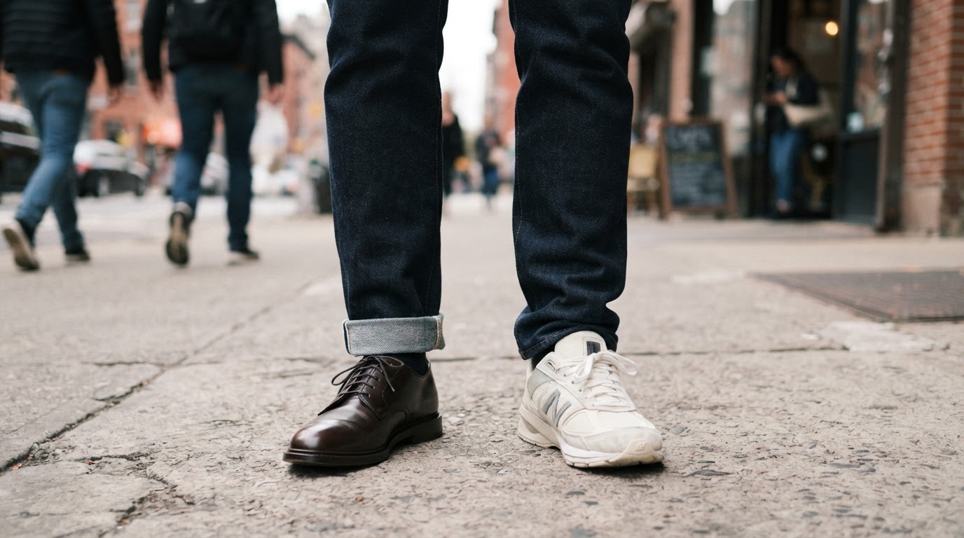
- Near-miss neutrals. Black with very dark navy, or dark brown with black. It reads as trying to match rather than contrast.
- Two competing accents. A bright scarf and bright shoes, or a bright bag and a bright shirt. Each accent is defensible alone; together they split attention in two directions.
- A temperature collision at one value. Cream next to cool grey, or tan next to charcoal, at the same lightness. Warm and cool can share an outfit, but not when they balance each other exactly.
Prints are a special case. A print is many colors at once, so a printed piece competes with every solid color already in the outfit. If a printed item is in the mix, treat its two loudest colors as the outfit's accents and keep everything else quiet.
How to check an outfit in 30 seconds
Run three tests in order as a quick checklist, and stop when one of them fails.
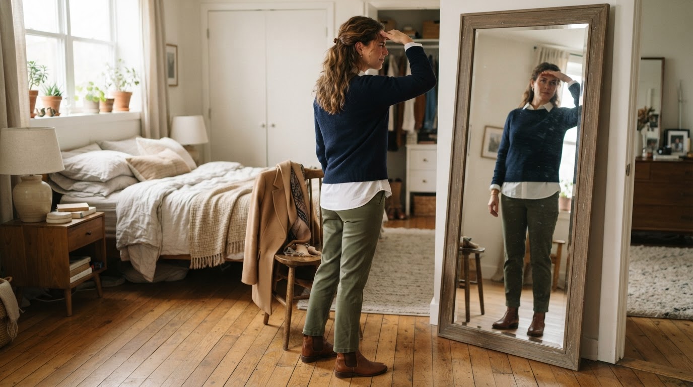
Test 1: squint. Close your eyes halfway and look at the outfit. Squinting removes detail and leaves value, so this test answers one question: is there one clear light-dark structure, or does everything blur into an even grey mass? If the outfit turns into a flat blob, the values are too close.
Test 2: take a greyscale photo. A photo in black and white removes hue entirely. If two colors that look distinct in the mirror become the same grey, that pair is fighting quietly. On a phone, the quickest version is the monochrome filter in the camera or an edit tab.
Test 3: step back three meters. At a distance you see proportion and structure instead of fabric. This is where close-enough colors stop mattering and where an outfit that fits well starts to read as deliberate.
What a pass looks like. One color dominates, one supports it, and one accent repeats somewhere small. The eye lands where you want it to land, usually near the face or at the waist, and nothing else competes for that attention.
How to fix a clash in under a minute
Fix a clash by changing one property on one piece, not by changing the whole outfit. The piece to change is usually the one with the highest saturation and the smallest coverage, meaning the loudest small item.
- Swap that piece for a neutral. Charcoal, cream, camel, and true navy sit comfortably next to almost anything. Removing one loud color is faster than adding a third.
- Change the value, not the color. Keep both colors but move one several shades lighter or darker. A gap of one or two clear steps resolves most almost-the-same clashes.
- Add a bridge. A belt, a pair of shoes, or a jacket in one of the two colors, or in a neutral, separates the fighting pair so they no longer touch directly.
- Cut the outfit to three colors. Count them out loud, including socks, shoes, and bag. Four or more colors at similar weight almost always reads as clutter.
- Move the strong color away from your face. Keeping a loud color at the bottom of the outfit gives the eye a safer place to settle.
- Repeat a color to make the tension intentional. If a bold pair stays, repeat one of the two somewhere small, such as a stripe, a watch strap, or a pocket square, so the combination looks chosen.
Done standard: after the change, re-run the squint test. If the outfit no longer flattens into one grey mass and no two pieces read as an accidental near-match, it is fixed.
When clashing is the point
Deliberate color clash works when the tension is single, repeated, and anchored. One loud pair is a statement; two loud pairs are noise. So choose one tension, repeat one of its colors somewhere small so the pairing looks intentional, anchor the rest of the outfit in neutrals, and let the proportions stay uneven: a large calm area against one small bright one. The trade-off is exposure, because a deliberate clash points attention at one specific part of the outfit, so everything else in that outfit has to stay quiet.
The difference between a deliberate clash and an accident is not the colors. It is whether the eye can tell that you meant it.
If you want a second opinion from a photo
A photo check is the fastest tiebreaker when the squint test keeps giving you a maybe. Your eye adjusts to an outfit within minutes, which is why a combination that felt obviously wrong at 7:00 can feel fine by 7:15: you stop seeing it. A photo preserves the first impression.
Dress Better is a web app that reads a full-body photo of today's outfit and returns feedback on color coordination alongside proportion, material, and occasion fit, without asking for height, weight, or style preferences. The product describes itself as a clothing linter rather than a stylist, pointing at what is already working and at one or two small conflicts worth adjusting. For a color question that is a useful shape of answer: a read on the outfit you actually have on, not a palette to shop for.
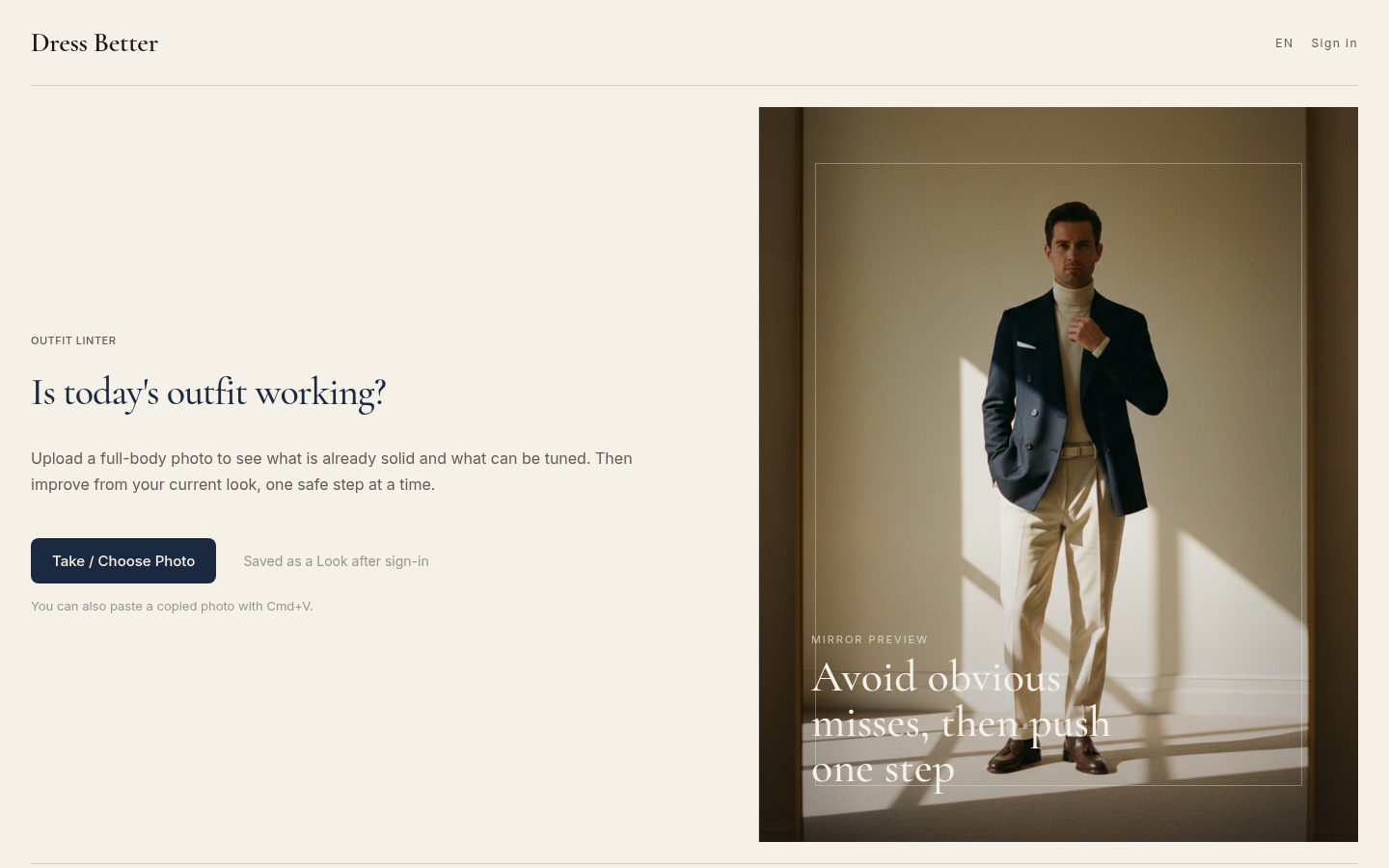
Desktop homepage first screen showing Outfit Linter eyebrow, "Is today's outfit working?" heading, Take/Choose Photo CTA button, and menswear editorial mirror preview image. Englis
Follow-up questions, grouped by intent
Meaning and basics
What does clashing colors mean?
Clashing colors are two or more colors in an ambiguous relationship: too different to read as a match, and too similar or too equal to read as a deliberate contrast. The term describes a confused contrast rather than a banned combination.
Is clashing always a mistake?
No. A clash becomes a mistake only when it looks accidental. The same high-contrast pairing reads as intentional when one color clearly dominates, the pairing repeats somewhere small, and the rest of the outfit stays quiet.
Specific pairings
What colors clash the most?
The loudest clashes come from opposite hues at equal weight: red with green, blue with orange, and purple with yellow, all at the same value and saturation. Those same pairs work well when one color is clearly dominant and the other is a small accent.
What colors don't go together in clothes?
There is no permanent list of forbidden pairs. The combinations that fail most often are two mid-tone colors from opposite sides of the color wheel, two near-identical neutrals at the same darkness, and two competing accents that split attention.
Do black and brown clash?
No. Black and brown can sit together comfortably. The problem case is black with very dark brown at almost the same value, which reads as an attempted match rather than a contrast. Separating the two by a clear step in lightness fixes it immediately.
Do navy and black clash?
Rarely. Black and navy work together when the navy is clearly lighter or clearly darker than the black. When both are dark and close, the pair reads as a mistake, and that near-miss is what people usually mean when they say two colors fight.
Can you wear red and green together?
Yes. Red and green are complementary, which makes them high-contrast rather than forbidden. The pairing works when one color dominates, when a neutral separates them, or when the two shades differ strongly in value. It fails when both colors are equally loud and equally large.
Your outfit right now
How many colors should an outfit have?
Three is a reliable working limit: one dominant color, one supporting color, and one accent that repeats somewhere small. One or two colors is also fine, and more than three can work when the colors sit at clearly different weights instead of competing equally.
Does a print count as a color?
A print counts as several colors at once. Treat the two loudest colors in the pattern as the outfit's accents, keep every solid piece quiet, and the print reads as the focal point instead of as a clash.
Does this work the same for men's outfits?
Yes. Hue, saturation, and value are properties of color, not of a wardrobe, so the same three tests apply to a suit, to a T-shirt with jeans, or to anything else. Men's outfits often fail on a different axis, though: several near-match neutrals sitting in dark values, which the greyscale test catches fastest.
How do I fix an outfit whose colors clash?
Change one property on one piece. Swap the smallest and loudest item for a neutral, or move one of the conflicting colors a few shades lighter or darker, then re-check with the squint test. Repairing the hierarchy of one outfit is almost always faster than replacing several pieces.