The short answer
An outfit color match works when the whole look reads as one palette with a clear hierarchy: one color leads, one supports, and one small accent is allowed to draw the eye. Most outfits that feel off are not wearing the wrong colors — they are wearing two or three colors that all want to be the main event. Decide what job each piece is doing, and most clashes resolve themselves without changing a single garment.
What matching actually means
Matching is a relationship, not a rule. Two colors work together when they agree on something — temperature, saturation, or depth — or when the contrast between them is clearly intentional.
A practical way to see this is to give every piece a role:
- Base: the largest area, usually a neutral. Trousers, a coat, or the dominant knit.
- Support: the second color, close enough to the base to feel related. A shirt or a lighter layer.
- Accent: the smallest area, and the only piece allowed to be loud. Shoes, a watch strap, a scarf.
Three roles do not mean three colors. A tonal outfit can use one hue in three shades, and a two-color outfit often looks more considered than a three-color one. What breaks an outfit is rarely a specific hue; it is two pieces competing for the same job.
The other variable is contrast. Low contrast — a navy jacket over a slightly darker navy shirt — reads calm and professional. High contrast — a dark base with a bright top — reads sharper and more casual. Neither is better. The common mistake is accidental contrast: two mid-tones stacked together until both look muddy.
The 60-second check you can run before you leave
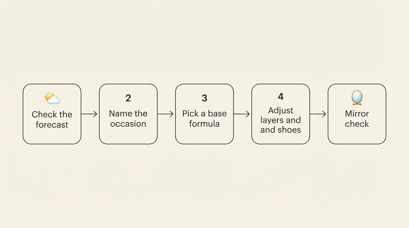
This takes less time than rereading a group chat, and it works with the clothes you already have on.
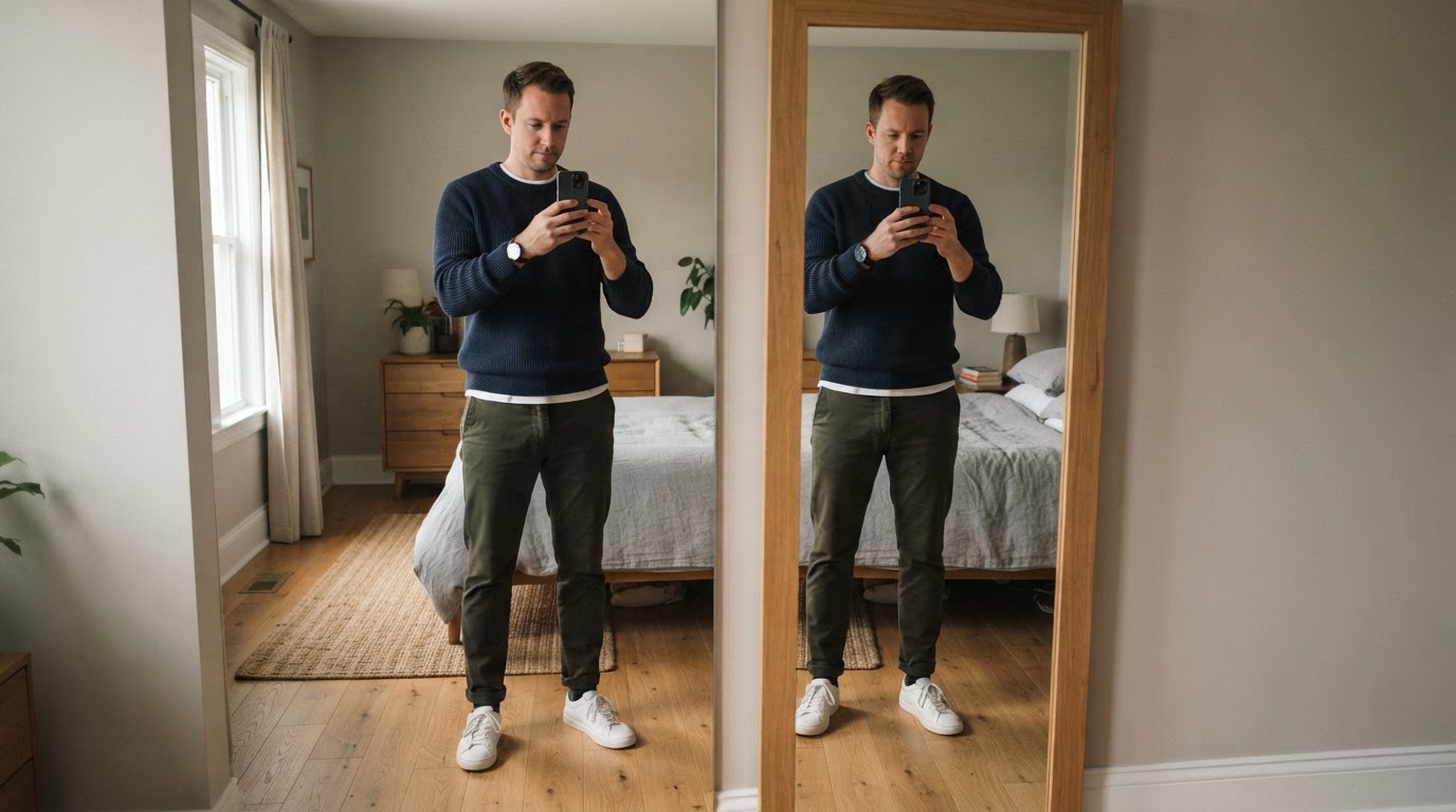
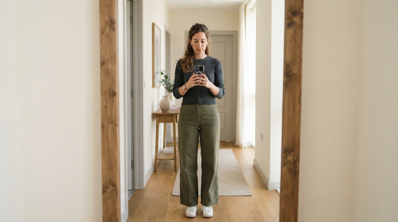
- Take one full-body photo in daylight. Stand near a window, hold the phone at chest height, and step back far enough that the whole outfit fits. One shot is enough.
- Squint at the photo. The color that survives is your base. If two colors survive with equal weight, you have found the conflict.
- Count the loud pieces. One is fine. Two means you pick which one keeps the job and mute the other, usually by swapping it for a neutral that is already in the outfit.
- Compare the contrast to the occasion. A low-contrast palette handles an office or an interview better than a party. High contrast flatters a night out more than a client meeting.
- Fix the smallest conflict only. Change one item, not the whole outfit. If the photo already reads as one palette, stop — you are done.
The sequence is short: one photo, the base color, the loud pieces, one change.
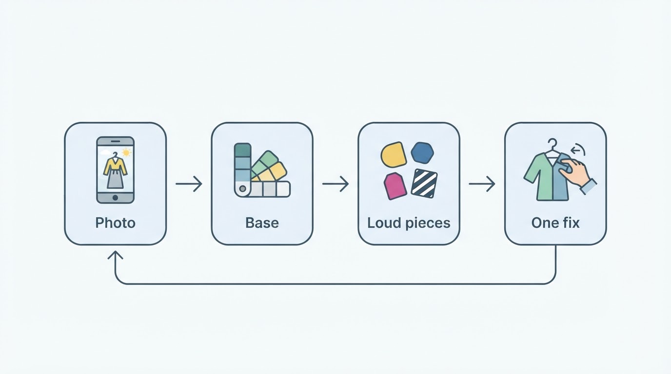
Completion standard: you can name the base color, the color supporting it, the single accent, and either one small change or none. If you can say that sentence out loud, your outfit passed the check.
Three relationships that cover most outfits
Once you know the roles, most combinations fall into one of three relationships.
Tonal. One color family in different depths: navy with light blue, charcoal with gray, olive with cream. This is the lowest-risk option and the easiest to repeat at work.
Analogous. Neighboring colors, like navy and teal or brown and rust. They share enough undertone to feel related while still giving the outfit some life.
Contrasting. A deliberate dark-and-light or warm-and-cool pairing, anchored by a neutral base so the contrast has something to sit on. Black with cream, camel with deep blue, gray with burgundy.
Pick the relationship first, then the pieces. You do not need a color wheel to do this — you need to know what the largest area is doing and whether the second color agrees with it.
Common clashes and the smallest fix
What you see | What is actually happening | Smallest fix |
|---|---|---|
Two saturated colors fight for attention | Both are playing the accent role | Keep the one you like, replace the other with the base neutral |
The outfit looks muddy even though each piece is fine | Warm and cool neutrals are sharing the same area | Match the neutral to the undertone of the largest piece |
Black and brown, or black and navy, look slightly wrong | Contrast and texture are too similar, not the hues themselves | Separate them with a lighter layer, or make one of the two clearly dominant |
Shoes, belt, watch, and bag all have presence | Accent pile-up | Choose one accent and mute the rest toward the base |
A patterned shirt over patterned trousers | Two scales competing, with color on top of it | Keep one pattern and make the adjacent piece solid |
Each of these fixes changes exactly one thing. That matters: the goal is to remove a conflict, not to rebuild the outfit.
Why a photo beats the mirror
Bathroom lighting is the most common reason an outfit that felt wrong at 7:45 a.m. looked fine in the office. A single warm bulb flattens contrast and pushes warm colors toward orange, so your judgment is being made by the light rather than by the clothes.
A daylight photo removes most of that distortion and gives you something you can compare later. It also lets you step back from the outfit instead of leaning toward a mirror, which is closer to how other people will see you.
One limitation is worth respecting: color is only one dimension of an outfit. A palette that works can still fail on proportion, material, or occasion, so fix the color without wrecking the rest. If the fix would change the whole look, the color was probably not the real problem.
Turn the photo into a structured check
If you want a second read on the photo instead of trusting your own squint, Dress Better's Outfit Color Checker is a free, photo-level check built for exactly this question. According to the product's description, it reuses the app's photo scoring engine rather than comparing your clothes to a generic color wheel, and it reports on color harmony, contrast structure, and whether small pieces — shoes, bag, jewelry, outer layer — are adding noise instead of supporting the palette. It also keeps proportion, occasion, and polish in view so a color adjustment does not damage the rest of the outfit.
The flow is short: open the checker, upload the full-body photo you already took (JPEG, PNG, WebP, HEIC, or HEIF, up to 10MB), and read the keep-or-adjust notes.
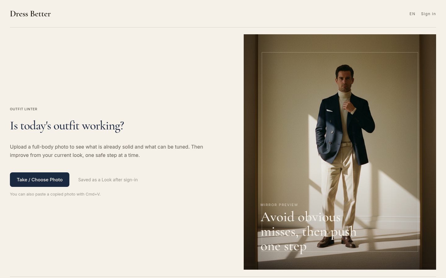
Desktop homepage first screen showing Outfit Linter eyebrow, "Is today's outfit working?" heading, Take/Choose Photo CTA button, and menswear editorial mirror preview image. Englis
If you would rather type your colors than upload a photo, the site pairs the photo checker with a quick text-based color check that returns a verdict and a suggested base, support, and accent ratio.
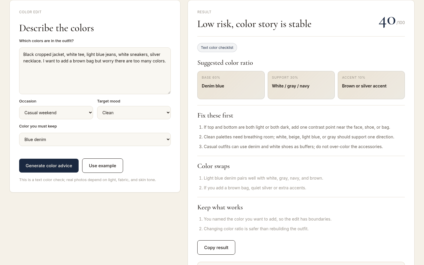
After submitting example outfit colors. Shows 'Low risk, color story is stable', 40/100 score, Suggested color ratio with Base 60% / Support 30% / Accent 10% breakdown. en-US.
Use it the way you use the 60-second check: read the notes, change one thing, and re-check once. The point is not a perfect score — it is leaving the house with a palette that holds together.
FAQ
Does black match everything?
Black is easy to pair, but it is not automatic. In a low-contrast outfit, black can make the other color look dull; in a high-contrast one, it is the strongest anchor you have. Judge it by the role it plays, not by a rule about black being universal.
How many colors should one outfit have?
Think in three roles, not three colors. One base, one support, and one accent is a reliable structure. A tonal outfit can do that with a single hue in three shades, and a two-color outfit often looks better than a busy three-color one.
Do shoes and belt have to match?
They need to relate, not match exactly. Same family — both brown or both black — or the same level of contrast against the trousers is usually enough. Forcing an exact match often makes the outfit look more formal than you intended.
I bought a piece I cannot match. What now?
Test it against the base colors you already wear. If it can work as a support or an accent against at least two outfits you actually wear, keep it. If it fights every base you own, the piece is the problem, not your wardrobe.
What if the colors look fine but the outfit still feels off?
Check proportion and occasion before you touch the palette. An outfit can be color-correct and still misread because a jacket is too long, a break sits in the wrong place, or the formality level does not fit the room. Fix color only after the other dimensions look right.
Can I check this without uploading a photo?
Yes. The timed check above works with the camera on your phone: daylight photo, squint, count the loud pieces. A structured tool is useful when you want a second opinion or a record of what you changed, not because the mirror method is invalid.
What to remember
- Assign roles before you assign colors: base, support, one accent.
- One daylight photo is a better judge than the bathroom mirror.
- Two loud pieces is one too many; mute the smaller one.
- Change one thing at a time, then stop.
- Color serves the occasion; it does not rescue a wrong fit.