Key answers
- Is there a free outfit color coordination checker? Yes. Free options fall into three groups: a manual color-wheel check, text-based checkers, and photo-based AI checkers.
- Which one should you use? The manual check for a fast decision, a text checker when you cannot upload a photo, and a photo checker when fabric, light, or drape matter.
- What does a color check measure? Hue pairing, light-dark contrast, saturation match, accent count, and the proportion of base to support to accent.
- What counts as a good score? There is no universal passing grade. A useful result names one or two specific changes; a bare number is not actionable.
- How many colors is too many? More than three working colors plus neutrals usually reads as noise. Neutrals include white, gray, navy, black, beige, and denim.
- How long does a free check take? The manual check takes about a minute, a text checker less than that, and a photo check as long as one full-body photo takes.
What a color coordination check actually measures
A color coordination check measures the relationships between colors, not the colors themselves.
No single color is a mistake on its own. What reads as a clash is usually one of five relationship problems:
- Hue pairing. Colors sit at random points on the wheel instead of following one relationship: neighbors (analogous), opposites (complementary), or neutrals with a single saturated piece.
- Light-dark contrast. Two colors of similar darkness merge into one flat mass, while two extremes with nothing between them can feel harsh.
- Saturation match. One muted, dusty piece next to one very bright piece, with nothing bridging them, looks accidental rather than deliberate.
- Accent count. Shoes, belt, bag, jewelry, scarf, and outerwear can each add a small competing color. Individually they are fine; together they become the noise.
- Area and proportion. When two pieces each look like "the main color", the eye has nowhere to land.
A checker, whether it is a rule you apply yourself or a tool that scores the outfit, is useful only when it points at the relationship that is off and names the smallest change that fixes it.
Method 1: Check the proportions yourself, for free
You can catch most color clashes in about a minute with two rules: the base-support-accent proportion and one deliberate relationship on the color wheel.
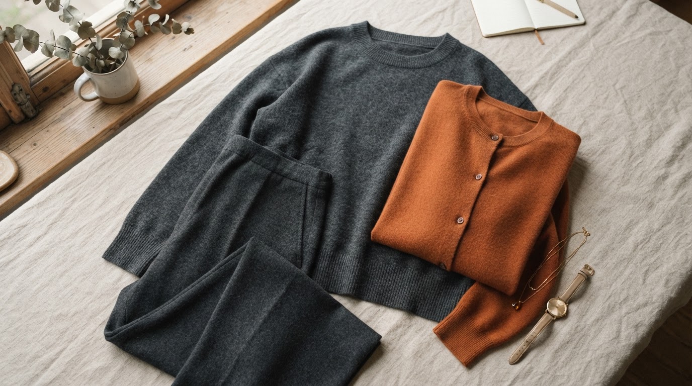
The proportion rule is often written as 60-30-10: the base color takes the largest visible area, the support color roughly half of that, and the accent the smallest share. It is a rule of thumb, not a law: its purpose is a clear hierarchy of areas, so that one color visibly leads.
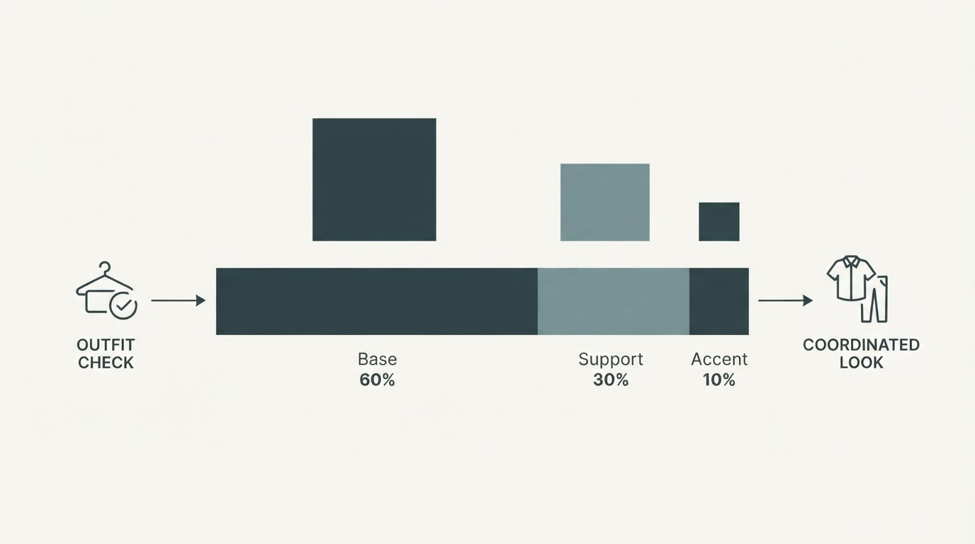
Run this check:
- Assign each piece a role. Base: the piece covering the most area, usually trousers, a skirt, a dress, or a long outer layer. Support: the top or knit beneath or over it. Accent: shoes, belt, bag, jewelry, scarf.
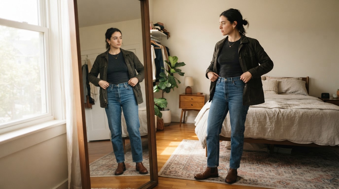
- Estimate the areas. Point at the outfit in the mirror and rank the pieces by area. If two pieces could each reasonably be called the main color, you have found the problem before any tool did.
- Pick one wheel relationship. Analogous (neighbors such as navy and mid-blue), complementary (opposites such as navy and orange), or neutral plus one (all neutrals with one saturated piece). Applying two of these strategies in the same outfit is the most common reason a combination feels accidental.
- Check contrast without color. Squint, or take a black-and-white photo. If everything merges into one gray mass, add a light-dark difference between two layers. If the contrast is already strong, leave it alone or reduce the number of competing pieces.
- Make one change. Swap the smallest item first. An accent is cheaper and faster to change than a base piece, and it is usually the item creating the noise.
You are done when you can say, in one sentence, which single item you would change and why. The check needs daylight and the outfit on your body; no app, account, or upload. What it cannot do is judge fit, fabric, or occasion, because it reads color relationships only.
Method 2: Use a free text-based color checker
A text-based checker is the fastest free option when you only need to know whether a few colors work together and you do not want to upload a photo.
You type in the colors of the pieces you are wearing, by name or hex value, and the checker returns a short verdict: a risk label, the balance between your colors, and one or two priority fixes. Nothing about how the outfit sits on your body is judged, because the tool never sees it.
Two things to check before you rely on one:
- Where the calculation happens. Some checkers state that the comparison runs in your browser and that your input is not sent to a server. If that matters to you, look for that statement rather than assuming it.
- What the tool cannot read. A typed checker judges color names, not how those colors behave in fabric. Texture, sheen, drape, and the light in the room can all change how the same three colors read.
Use it as a fast pre-check: confirm the color logic, then make the change it ranks first.
Method 3: Use a free photo-based color checker
A photo-based checker is the most complete free option, because it reads the colors as they appear on a real outfit in real light instead of judging color names on a list.
Get the photo right first, or every result after it is noise:
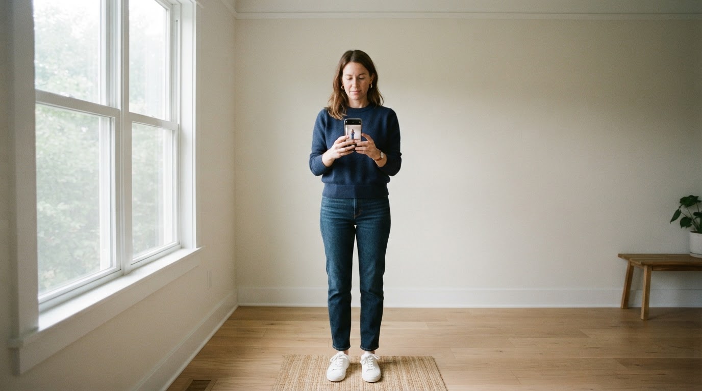
- Take a full-length photo in daylight. Face a window rather than the room light, include your shoes, and keep the background plain. Skip filters.
- Look for dimension scores, not one number. A useful check reports color harmony, contrast structure, and accent noise separately, because the fix depends on which dimension is off.
- Read the keep list before the fix list. The pieces that already work tell you what to preserve; the fixes should be the smallest set of changes that leaves the rest intact.
- Change one or two points and re-check. Two re-checks are usually enough to see whether the change helped. More than that and you are tuning to camera conditions rather than to the outfit.
One free example is Dress Better's Outfit Color Checker. Dress Better, which publishes this guide, built it to work from a photo rather than a generic color wheel: it reports color harmony, contrast structure, and whether shoes, bags, jewelry, or outerwear are adding noise, and it keeps proportion and occasion information in the same result so that a color fix does not quietly break the rest of the look. The free tier accepts JPEG, PNG, WebP, HEIC, and HEIF files up to 10 MB. It comes from the same free tools hub as Dress Better's text-based color checker. You can start with a typed check and move to a photo only when fabric and light matter.
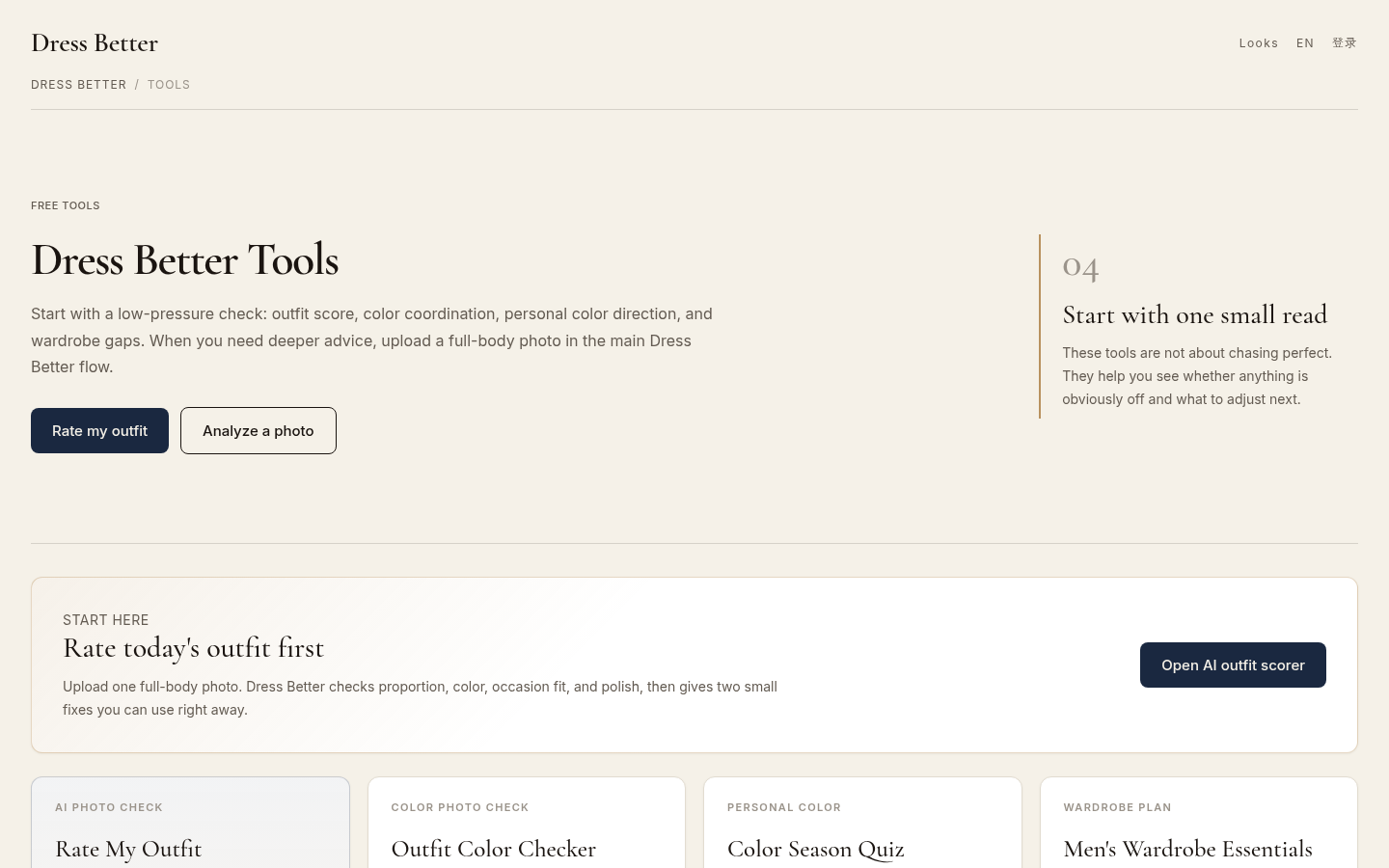
Tools directory page listing all 4 available tools: Rate My Outfit, Outfit Color Checker, Color Season Quiz, and Men's Wardrobe Essentials. Shows "Rate today's outfit first" sectio
Photo checkers do have a blind spot: they judge the photo, not the outfit. An angle that hides a jacket color, or a lamp that warms every tone, changes the result. Compare like with like, using the same location, light, and phone.
How to read a color coordination result
Treat the result as a triage list, not a grade.
- Read the keep list first. Knowing what already works stops you from changing the wrong thing.
- Fix the smallest piece. Accents are the cheapest correction and the most common source of noise.
- Change one or two items, not five. A single swap lets you see whether the diagnosis was right.
- Re-check under the same conditions. Different light produces a different score for the same outfit.
- Keep the reasoning, not the number. A result that says "contrast is flat" is useful; a bare score is not.
A lower score is not a failed outfit. It usually means the check found a clearer problem to fix, which is exactly what you paid nothing for.
Common mistakes that make a color check misleading
Most bad color reads come from the conditions of the check, not from the outfit.
- Checking under warm indoor light. Tungsten and warm LEDs shift every color. Daylight is the reference.
- Cropping out the shoes and the bag. The accent items are usually the cause of the noise, and they are the first thing a mirror photo cuts off.
- Fixing hue when the problem is contrast. If two colors seem like the wrong pair, the real issue is often that they sit too close in darkness, not that the hues are mismatched.
- Treating a trend palette as a rule. Seasonal palettes and trending combinations are starting points. If the relationship works, the trend list does not overrule it.
- Chasing a perfect score. The goal is one or two changes that leave the outfit feeling like yours, not a number that satisfies an algorithm.
When a free color check is enough, and when it is not
Free checkers handle most daily color questions, and they are weakest on the things a photo or a typed list cannot show.
A free check is enough when you want to know whether three pieces coordinate, whether one accent is too loud, or whether to change something before you leave the house. It is not enough when the question is about fabric and texture, fit and proportion, a dress code with a specific requirement, or which colors flatter your own coloring. That last question is color analysis, which asks what suits you rather than whether today's outfit coordinates. A free seasonal quiz can be a starting point there, but it is a self-assessment, not a verified analysis.
The practical sequence is simple: run the one-minute manual check first, use a text checker if you want a second opinion without a photo, and use a photo-based check when you want the outfit itself judged.
Follow-up questions
Before you check
Do I need to know color theory to use a free checker?
No. Every method above reduces to naming the main color, checking the light-dark contrast, and counting the accents. Knowing the labels helps, but the check itself does not require the vocabulary.
Can I check an outfit without uploading a photo?
Yes. The manual proportion check needs no tool at all, and text-based checkers work from color names alone. A photo is only necessary when fabric, drape, or the actual light on the outfit matters.
Choosing between free checkers
Text checker or photo checker: which should I use?
Use a text checker for a quick decision about a few colors, and a photo checker when you want the outfit as it actually appears. The typed check is faster and keeps the input on your device; the photo check sees more and takes longer.
Are free AI color checkers accurate?
They read what the photo shows, which makes them consistent but not authoritative. Treat the result as a second opinion: useful for spotting a relationship you missed, not as a verdict on whether you look good.
Reading the result
What do base, support, and accent mean?
Base is the color covering the largest area, support is the second color, and accent is the small piece, such as shoes, bag, belt, or jewelry, that adds contrast. Most outfits read best with one clear base and one clear accent.
What is a good color coordination score?
There is no shared scale across tools, so a raw number is only meaningful inside the same checker. Judge the result by whether it named a specific, small change you agree with.
Why does my score change between photos?
Because the photo changed, not necessarily the outfit. Light, angle, and what is visible in the frame all affect what a checker can measure.
Fixing the outfit
What is the fastest fix for clashing colors?
Swap the smallest accent first, such as shoes, bag, belt, or scarf. Accents carry the least visual area but cause most of the perceived noise, so changing one is the cheapest way to rebalance the outfit.
Is 60-30-10 a strict rule?
No. It is a proportion guideline for a clear hierarchy of areas. Two colors can work perfectly well if one visibly dominates; the failure case is an outfit with no dominant color at all.
The bottom line
Free color coordination checkers are a triage tool, not a judge. Use the one-minute proportion and color-wheel check to catch obvious clashes, a text checker for a fast second opinion, and a photo-based check when you want the real outfit assessed. Then change one thing and leave the rest alone.